Colli Euganei, Italy · Brand Identity + Website + Label Design · Concept
Roncolivo
A forty-year-old wine estate with no identity, no digital presence, and no way to explain itself to the people it was made for.
The estate sells only to those who already know — and that circle was no longer growing.
There was no visual identity. No label system worth keeping. No website. Nothing that could carry the weight of forty years of unhurried, minimum-intervention winemaking to a person who had not already been told where to look.
The estate did not need more visibility. It needed the right visibility — a presence that would reach the kind of person who reads labels slowly, and make them feel the wine was already theirs before they had tasted it.
The solution
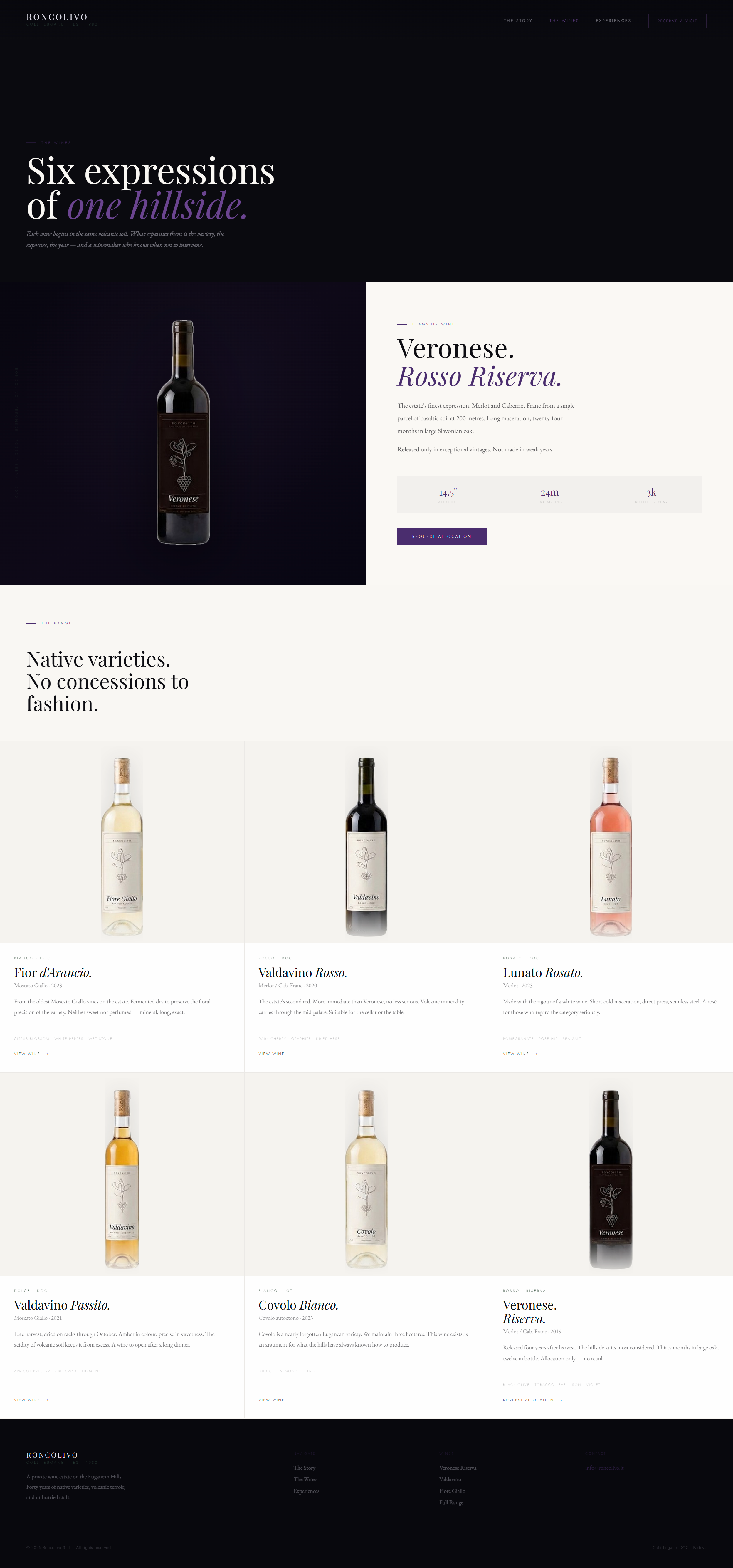
A complete identity system built from the estate outward — not applied to it.
Logotype and vine mark, primary and reversed. Five documented colours. A botanical label system of six ink illustrations, each differentiated by ink weight. A typography hierarchy documented for independent use. Everything the estate needs to present its wines without borrowing from anyone else's language.
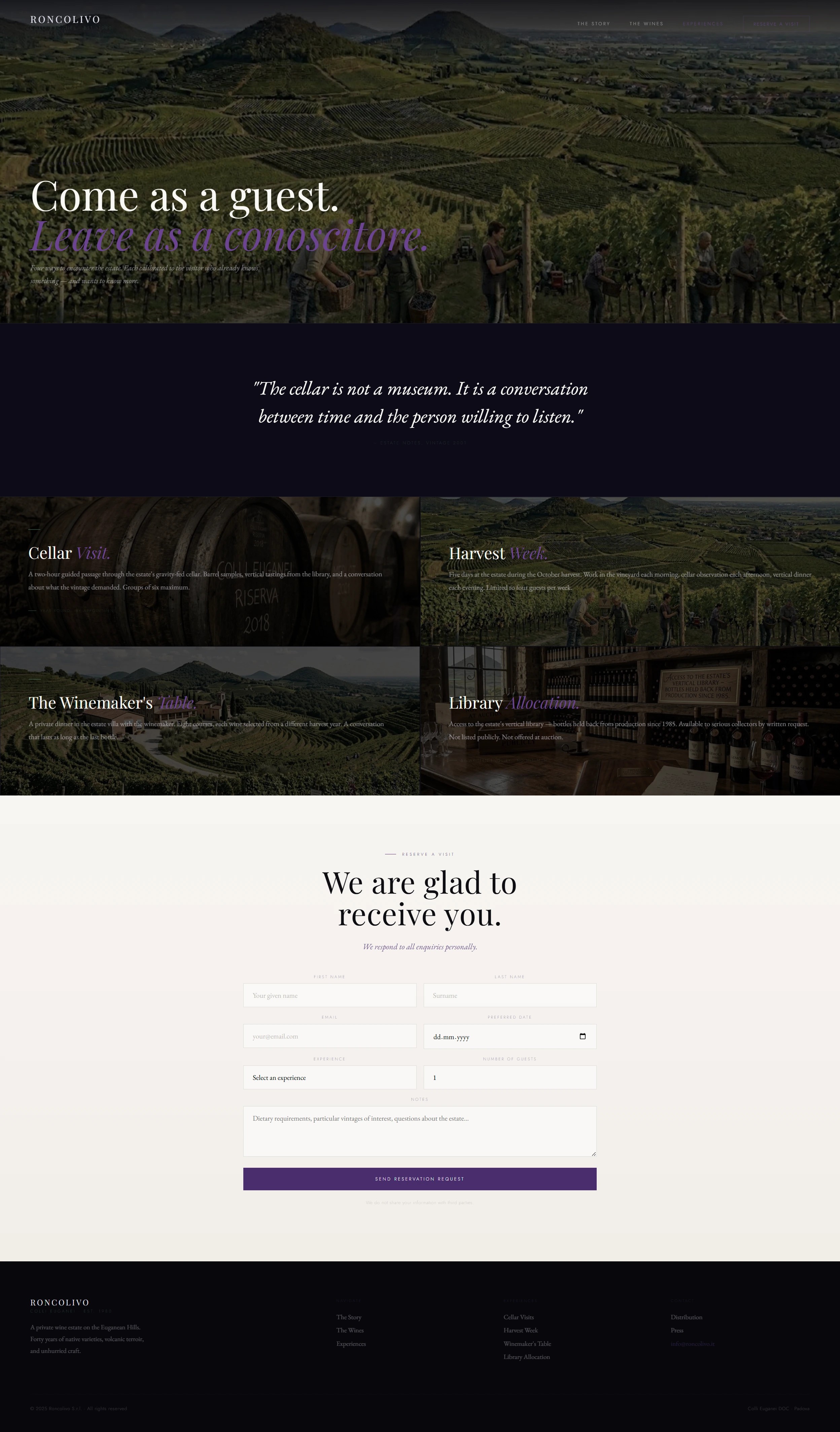
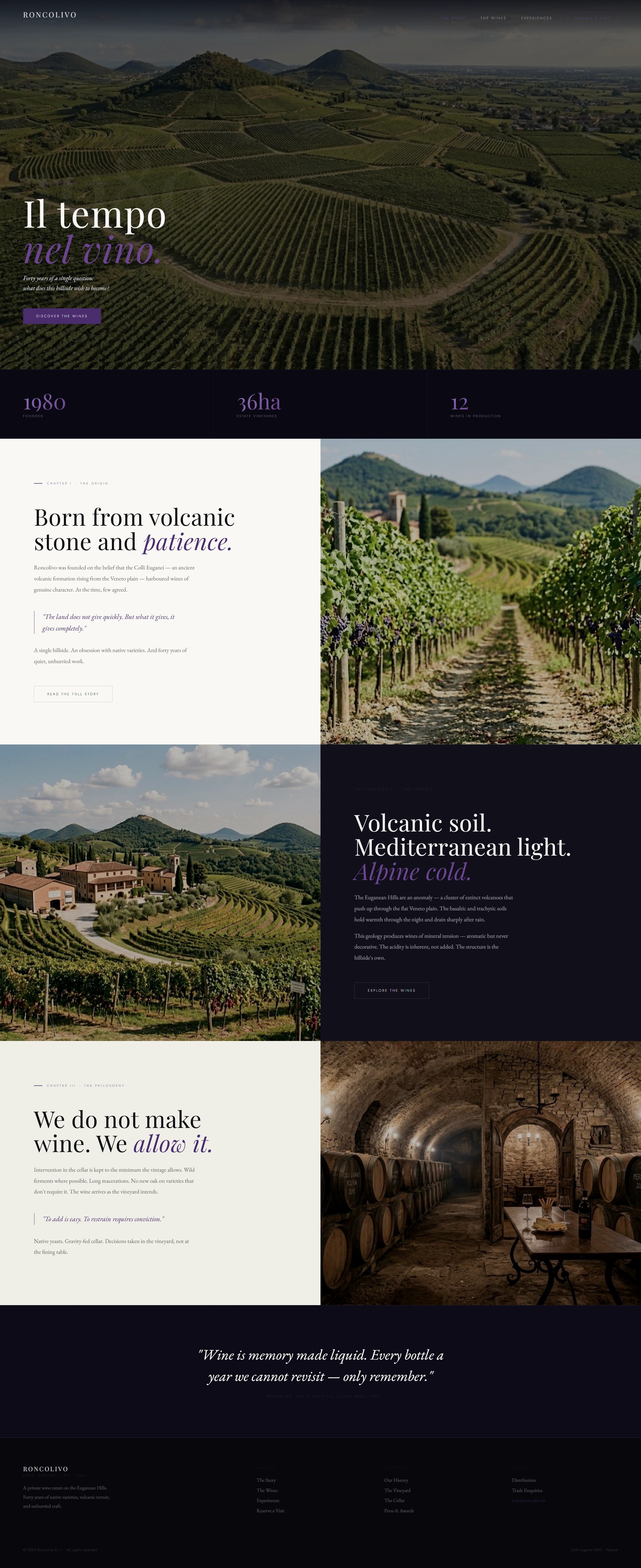
The website runs three public pages — homepage, wines, experiences — structured around estate photography and copy that earns attention quietly. Behind them, a private dashboard manages experience availability, booking requests, and a library allocation tracker. A digital asset library closes the system.